VISIT SITE
Here is a selection of Q&As from Your Kent Wedding magazine whether it be about flowers, hair and makeup, fashion, wedding themes, health & beauty, cakes, stationery, legal advice. If you would like your question answered by our experts, please email it to editor@yourkent.wedding
To view more expert advice on a different topic, please select one from the list below.
Cake Expectations
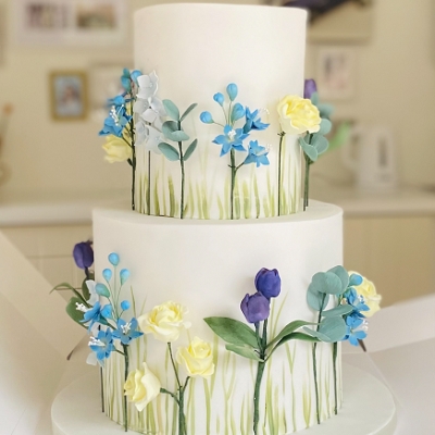
| Q | How can we incorporate the spring season into our cake's design and flavour? |
| A | Claudia Newberry says: Many of my couples look to seasonal blooms as a decorative element on their wedding cake, and with many real flowers not suitable for use on a cake as they are toxic, sugar flowers are the perfect way for adding seasonal flowers and foliage. I love making sugar flowers; every intricate detail can be recreated to make the blooms botanically correct, but at the same time there is the creative freedom to make flowers a different size or colour from the 'real thing'. Wedding cakes reflect the style and décor of your wedding, and well-made sugar flowers will blend in seamlessly alongside real flowers. As far as flavours go, fresh flavours take over from more wintry ones; high on the tasting list during upcoming consultations in the studio are lemon and elderflower, white chocolate, vanilla bean, and passionfruit. I recommend choosing lighter flavours for your cake tasting even if you are tasting them in the colder months. In my experience, taste buds and cravings change depending on the season, and if you are planning a spring wedding, consider lighter flavours and choose your favourites from your cake designer's menu. |
Claudia Newberry, Purple Flour
Just One Slice
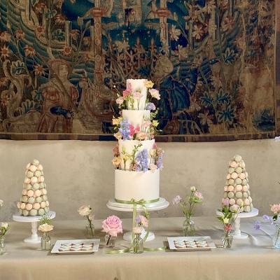
| Q | What cake flavours and designs will be popular in 2025? |
| A | Purple Flour says: Looking at the year ahead and especially at wedding cakes, a lot of my couples have opted for classic flavours alongside more adventurous flavour combinations. I encourage my couples to choose a different flavour for each tier, providing a selection of tastes and textures. Top of the list for 2025 are lemon, red velvet, coconut and lime, and sticky toffee cakes, all layered with delicious whipped buttercreams and fillings with complementing flavour profiles. In terms of designs, vintage and Lambeth-inspired wedding cakes are featured highly alongside romantic cake designs with ribbons and bows in soft, flowing fabrics. Where 2024 has seen a lot of white and pastels with green shades, I am expecting to work with floral decorations in brighter colours with pink, coral and red featuring highly. Meadow-style flowers on cakes and dessert tables featuring macarons and cookies alongside the wedding cake are continuing to be strong into 2025. Fully covered cakes (buttercream or sugar paste) are continuing to push semi-naked style wedding cakes aside. |
Purple Flour, Purple Flour
Too Hot To Handle?
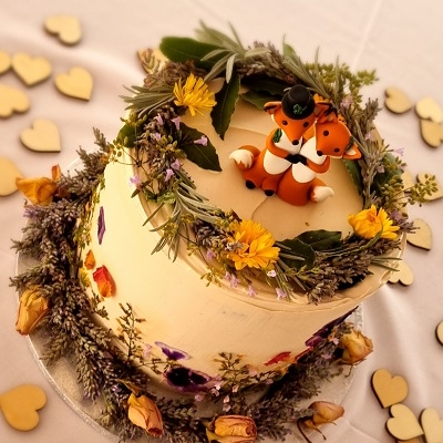
| Q | We're looking to host our nuptials al fresco and would love to display our cake alongside the buffet which will all be outside too. As it will be a vegan cake, will this withstand an outside environment? |
| A | Michelle Janson says: It really comes down to the weather on the day and a few other factors. If the buffet is under some sort of terrace, tent or canopy which provides good shade all day, plus there's a bit of a breeze and the temperature isn't too hot, then yes, it's possible. I use cocoa butter in my buttercream for wedding cakes so that they can withstand long periods of time out the fridge. The main thing is that it's not standing in direct sunlight either inside or outside as that's where problems start. The other option is, if there's a cold room/fridge at the venue where the cake can sit until right before people start helping themselves to buffet, then the cake can come out to be displayed at that time − or if it's in the evening then it's also doable. I've done quite a few cakes where they have been in semi-outside surroundings, vegans love getting married in forests and tents! •The first pic was in a tent at Wise Wedding Venue in Tonbridge. •The second was at The Dreys in Sittingbourne. •The third was at the Barnyard in Upchurch on the hottest day ever, that cake was kept in a cold room until later in the evening. |
Michelle Janson, My Lavender Kitchen